Rates as of 06:00 GMT
Market Recap
The markets are still being dominated by Russia/Ukraine. Markets were extremely volatile yesterday and overnight, perhaps due to fears – which proved unwarranted – about the apparent attack on the Zaporizhzhia nuclear power plant in eastern Ukraine, Europe’s largest nuclear power plant.
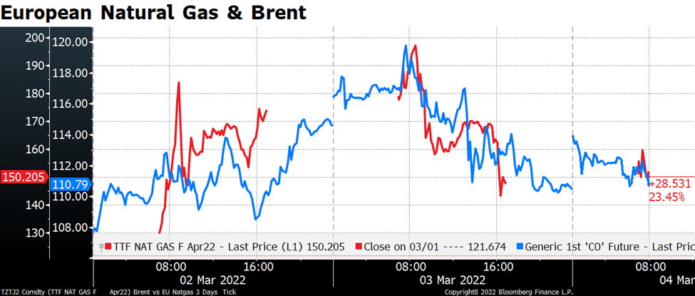
European natural gas futures for example hit a record high of EUR 200, up an incredible 56% from their lows of the previous day, before closing at EUR 145.50, down 27% from the intraday high. Brent futures moved in tandem although not as big swings in percentage terms obviously.
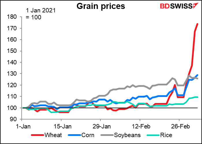
Commodities continued to soar, with the Bloomberg Commodity Spot Index moving further into record territory. Wheat and corn continued to rise, up an amazing 21.8% and 1.7% respectively. Wheat prices are up 74% so far this year!
Volatility is elevated across all markets, particularly bonds.

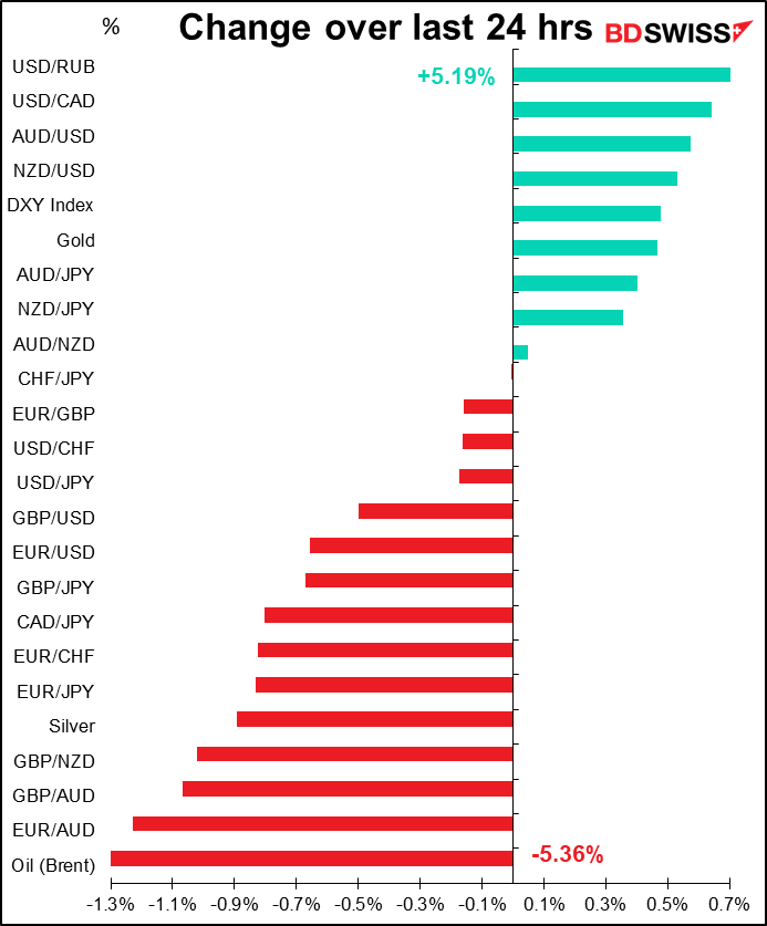
In the currency market, the tensions in Europe continue to weigh on EUR. EUR/CHF has been on a steady decline almost all week. Europe is going to be hit hardest by the sanctions, putting the European Central Bank with a difficult decision: inflation vs growth. The market thinks they’ll ignore inflation in order to support growth.

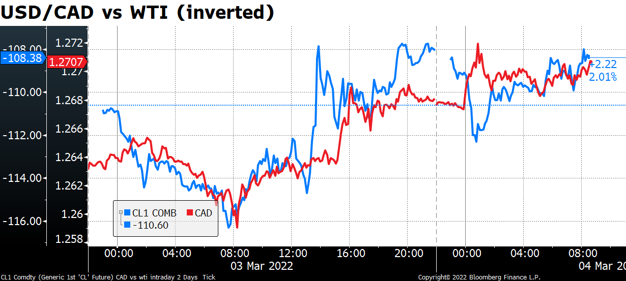
AUD and NZD moved higher along with most of the commodities. But CAD was pressured by the steep fall in oil, which is interesting as the two haven’t been moving in tandem recently. CAD has been trading with risk sentiment and the growth outlook rather than the oil price. Perhaps the commodity currencies are getting to be more closely linked with commodity prices again?
It was also interesting to see AUD, the main barometer of economic activity, as the #1 gainer and CHF, a safe-haven currency, as #2. It’s hard to reconcile these two movements.
Today’s market
Note: The table above is updated before publication with the latest consensus forecasts. However, the text & charts are prepared ahead of time. Therefore there can be discrepancies between the forecasts given in the table above and in the text & charts.
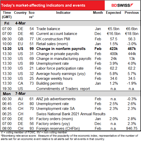
The European day kicks off with EU retail sales. Not a major event for the EU, but still important for gauging the economy. Sales have been pretty lackluster since August and fell last month, but they’re expected to rebound.
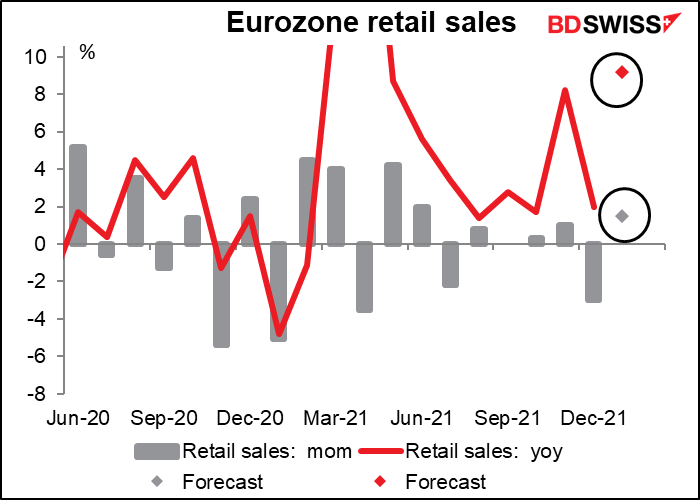
The EU’s performance is about par for the course. The US has been the outlier with regards to retail sales thanks to the outsize US fiscal support program.

But you’re not interested in European retail sales, are you? You want to know about the big indicator of the day, indeed of the week, arguably of the month: the world-famous US nonfarm payrolls (NFP).
The market is looking for a solid 423k increase in the NFP, with estimates ranging from +200k to +730k. (There’s one outlier forecast at 80k but I’d ignore that as it’s old.) Confidence increased after Wednesday’s higher-than-expected ADP report, which came in at +475k vs estimates of +375k.
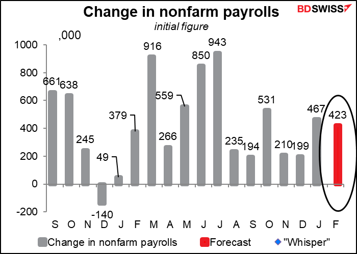
The ADP report tracks private payrolls, not the headline figure. The forecast for private payrolls is virtually the same – +383k.

How much can we trust that forecast? Not very! Since January 2021 it’s beaten estimates six times and missed seven times. They’ve been anywhere from 743k below estimate (-136%) to 342k above (+37%).

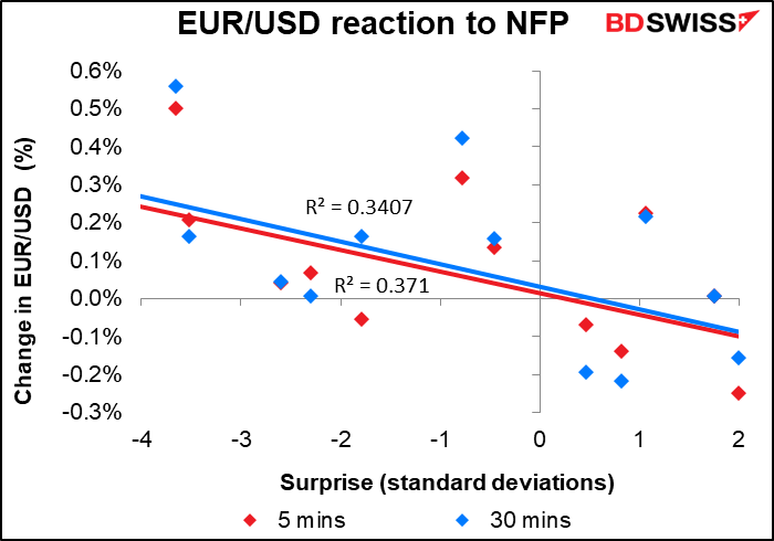
For those who want to make a quick trade, USD/JPY has the best immediate reaction to the figure (the change in USD/JPY in the first five minutes after the release is closely correlated with how much the NFP misses or beats the forecast).

However over the next 30 minutes, the reaction of EUR/USD is about the same.
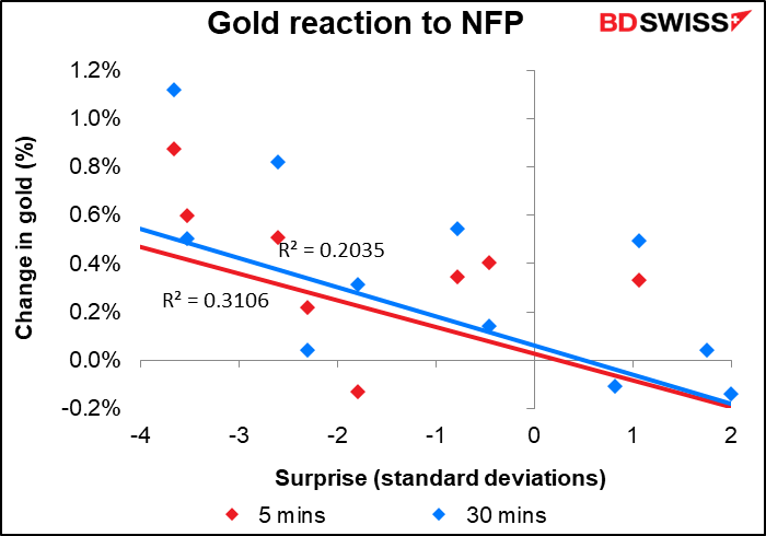
Gold is about as good.
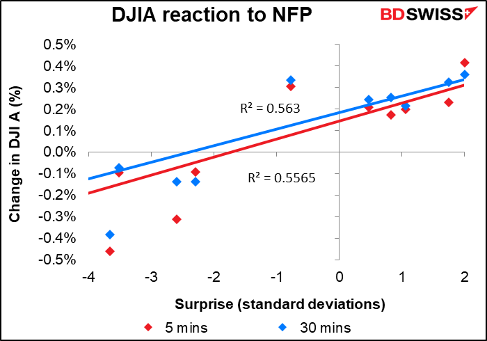
For equity market players, the DJIA has a much better relationship than the S&P 500.
The unemployment rate is expected to tick down while the participation rate is forecast to remain the same. Technically I think the Fed would like to see a higher participation rate but at this point in history I don’t think it matters – the participation rate is being held down by social changes out of their control, not a lack of jobs. From their point of view they’ve achieved their mandate of “full employment” and so they better get on with the job of ensuring “stable prices.”

Average hourly earnings are expected to creep up. I’m not sure how the Fed sees this – a good sign that equality is improving or a bad sign of a possible wage/price spiral?

According to the Atlanta Fed’s wage growth tracker, the lowest-paid people are getting the highest pay raises and the highest-paid people are getting the lowest pay raises. So my guess is that the Fed is pretty comfortable, even happy, with high wage growth because they’ve been accused in the past of fostering policies that promoted inequality (helping boost asset returns and thereby enriching the rich, who are the ones who own most of the assets).

Now, if you want an obscure indicator that nobody pays attention to but is real important, you can do no better than the average weekly hours. This is just how many hours the average hourly employee averages in the average week. As you can see it doesn’t move that much, which is probably why people don’t pay much attention to it. Even in the worst of the pandemic it only dropped to 34.1 from around 34.4, then rebounded up to 35.0.
However, it’s crucial, because at any given time there are millions more people working than not working. Even at the worst of the pandemic, when the unemployment rate was hitting depression-like levels, there were 133.3mn people working in the US. So if each one of them works just 1/10th of an hour longer each week and each of them makes $30/hour on average, as they did that month, that would mean $3 more per person per week X 133.3mn people = about $400mn more in aggregate income. That would be equivalent to the weekly income of 390k more people working at the average wage. So when you’re looking at the impact on incomes and therefore spending and therefore on GDP, the impact of a change in hours worked is usually greater than the impact of the change in the number of jobs.
Average weekly hours have been coming down since last May but are expected to start recovering this month.

That’s probably because the virus is receding. Average weekly hours have more or less tracked new cases of the virus, probably because many service-sector workers had their hours cut back as people stopped going out as much (note that average weekly hours are inverted in the graph). Assuming that new cases continue to fall and people get back to some semblance of a normal life, average weekly hours could continue to rise, boosting people’s incomes and helping to offset somewhat the impact of high inflation.

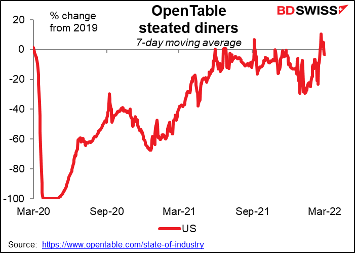
For example, data from the restaurant booking site Opentable.com shows that bookings at US restaurants have returned to their pre-pandemic level. That should mean demand for restaurant staff and working hours at restaurants are returning to pre-pandemic levels (although unfortunately the number of restaurants probably isn’t).