The week now ending had several memorable events: life outside the EU began for Britain, Trump escaped being tossed out of office, there were a number of excellent US economic indicators, and the Democratic primary season got off to a disastrous start (so too did the Republican primary season for a different reason – but we’ll leave that one alone). But the financial markets are only looking at one thing: the coronavirus.
If you’re interested in tracking the virus, Johns Hopkins University has a great site with a map of the outbreak and much data. You can see it here. The World Health Organization (WHO) has its own coronavirus pages, including a daily situation report. Thursday’s situation report has a rather discouraging graph of cases of the virus identified outside of China, which had been trending down but suddenly jumped up again. (There was another graph that did not show the same jump in the last two days, but that graph seems to be less complete than this one.)
I’m not an epidemiologist, so I’m not going to try to discuss the virus. I am a pessimist though so I’ll give you my opinion: why would China put Wuhan — an entire city of 11mn people — on lock-down unless this was really, really serious? There are indications that the worst is over — the absolute number of cases outside of China has declined and the rate at which the virus is spreading outside of Wuhan province appears to have peaked. However, China unilaterally cut its tariffs on $75bn of US goods Thursday – why would they do that now if things are starting to get under control? I can’t help but think that it won’t be over soon or easily.
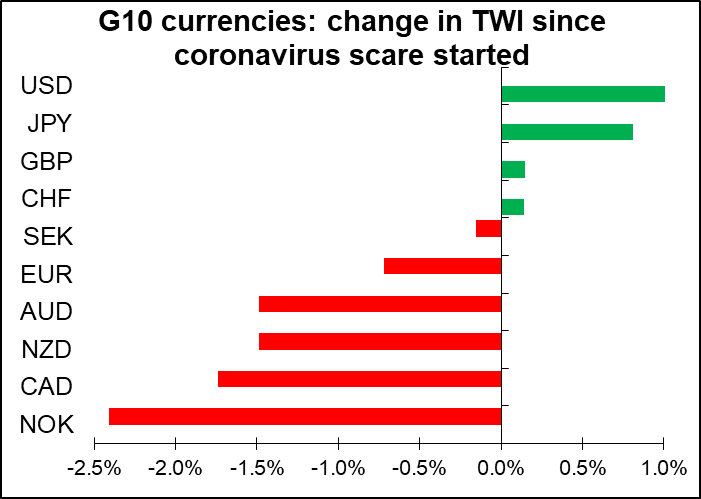
As an FX strategist, my main question would be, How has the market moved over the period when the virus has been in the news, and how might it move in the future? Google Search data shows that people started searching for the word “coronavirus” from Monday, 20 January. So let’s take Friday, 17 January as our starting date.

Since then it’s been a pretty classic “risk off” result, with the safe-haven JPY and CHF gaining and the commodity currencies falling. The oil-dependent NOK and CAD were particularly hard hit, followed by the China-dependent NZD and AUD. The order maybe isn’t exactly what one would expect, as Australia is more dependent on exports to China than New Zealand is, plus New Zealand’s exports to China are mostly food, which is less sensitive to economic activity than Australia’s iron ore and coal. People still have to eat even when the steel mills are shut.
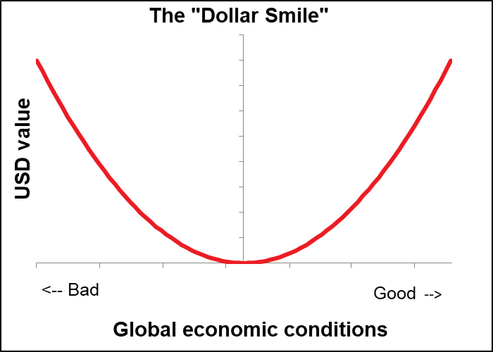
The good performance of the dollar is in accord with the “dollar smile” theory of how the dollar trades. That’s the idea that when things are good, people buy USD because the US economy is the strongest. When things are bad — like in 2008 or now with the coronavirus – people buy USD because it’s the ultimate “safe haven” currency. It’s when we’re in a “Goldilocks” scenario, neither too hot nor too cold, that people sell USD and buy EUR.
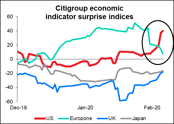
The dollar has also seen a number of better-than-expected US economic indicators over the last week, which has also boosted it no doubt, especially in contrast to the disappointing EU indicators. The two currencies’ economic surprise indices are mirror images of each other.
There may also have been some measure of closing out of carry trades, as one would expect when investors are becoming risk-averse. The currencies that depreciated the most tended to be those that started out with the highest yields.
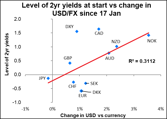
In that respect, CAD held up relatively well – this analysis would suggest it should’ve fallen much more, particularly because of the fall in oil prices at the same time. Perhaps it isn’t being used much in carry trades. The same perhaps could be said in the opposite direction for EUR – despite having the lowest 2-year yields, it did not appreciate vs USD, which suggests that it isn’t being used as a funding currency as much as one might’ve expected. (Note that the graph above shows the movement of the currency relative to the dollar, not the movement in the currency pair as usually quoted, so that all of them are shown on a consistent basis.)
Here’s how the major currency pairs, plus gold, silver and oil, have fared since the beginning:

One point that’s clear from this graph, as well as the graph of trade-weighted indices, is that GBP has done relatively well over this period too. I think GBP is a special case; it’s not affected so much by the general risk on/risk off trend as it is marching to the beat of its own drummer, who is playing more like Keith Moon than Joe Morello. The market is much more concerned about how the UK-EU negotiations will affect the UK than how the virus will. There’s naturally a lot of concern about how the Bank of England will react to events as well. It’s what George Soros called “reflexivity” – the market reacts to the economy, say by pushing down the currency or pushing up bond yields, and the Bank of England then reacts to the market, which causes the market to react to the Bank. So the ultimate end-point is hard to predict until you’ve thought through all the iterations of what will happen and how various actors will respond to it.
Note too in the graph above of economic surprise indices that UK economic indicators have been improving recently – less and less disappointing. That’s supporting the currency as well.
Personally though I expect the reality of the task that the UK has ahead of it to start making more of an impression on the trading community. For example, UK foreign secretary Dominic Raab is going to meet with Australian Trade Minister Simon Birmingham for a few hours next week. Great! Go for it! Meanwhile, a team of EU officials will meet their Australian counterparts for four days during the week for the sixth round of negotiations towards the EU-Australia free trade agreement. Got that? One British guy is talking with his Australian counterpart for a couple of hours, vs a team of EU officials talking to their counterparts for several days. Who’s likely to come out with the better deal, and by when? Repeat that process around the world and you see how unlikely it is that Britain will be able to improve its trade position after Brexit. And the country already has one of the widest current account deficits as a percent of GDP of any country in the world.
On other topics, I was surprised to see gold rise relatively little during this risky period, and for silver to actually fall over that time. The gold/silver ratio has been rising, but it remains well below its recent peak.
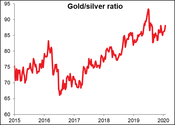
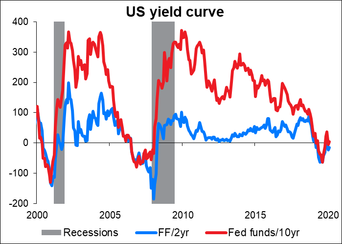
I think the gold/silver ratio can rise further. My guess is that the fall in silver at a time when gold is rising is a forecast of reduced industrial demand as investors mull the impact of the coronavirus on economic activity. Similarly, the US yield curve has inverted once again, another sign that the market fears recession is near.
And yet despite all this, FX vol continues on what seems to be its inexorable path downwards. Sigh.


The coming week: Powell testimony, US CPI, UK GDP, RBNZ meeting
The coming week has a few points of interest for the market.
The main focus, more out of habit than anything else, will probably be Fed Chair Powell’s testimony to the House Financial Services Committee (Tuesday) and the Senate Banking Committee (Wednesday). I say “out of habit” because of course everyone pays attention when the Fed Chair speaks, but that doesn’t mean he always says anything new. The FOMC meeting and his press conference afterwards was about two weeks ago. Not much has changed in the world since then; why should his comments change then? Maybe he knows a bit more about the coronavirus, but I don’t think anyone knows that much more now than we did then. So I’d expect him to sing the same tune that he sang back then. To remind you, he said monetary policy was “well positioned” and “appropriate,” but could be changed if there were a “material reassessment” of the outlook. It was nothing new then and it’s not likely to be anything new when he says it again this coming week.
Among the US economic indicators, the main focus will be on the US consumer price index (CPI) on Thursday. This isn’t the Fed’s preferred inflation gauge – that’s the US personal consumption expenditure deflator – but the market treats this as if it is. In any case the two measures do tend to move together over the long term, although nowadays the more important core PCE deflator is substantially below its CPI counterpart by around 70 bps.
The headline CPI figure is expected to show an acceleration in inflation, but the core figure is forecast to show a slowdown – and looking at what’s happened to the oil price since January, I expect the headline figure will slow down next month as well. But in both cases inflation remains comfortably above the Fed’s 2% target level, so this should by no means trigger the kind of “material reassessment” that would be necessary for a change in policy. USD neutral.

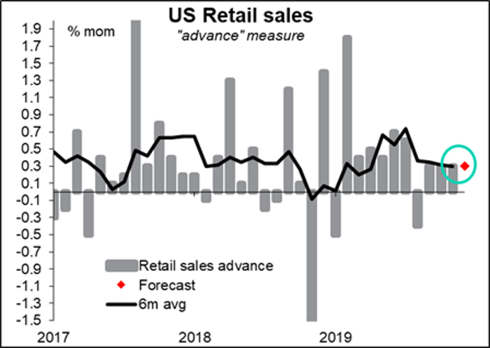
The US also announces US retail sales on Friday. This is a key indicator as Powell and other officials have placed the burden of supporting the US economy on the broad shoulders of the US consumer. It’s expected to be up 0.3% mom, which would be exactly in line with the six-month trend. No change in the trend would most likely be neutral for the dollar.
Britain has “short-term indicator day” on Tuesday, when they announce GDP, industrial & manufacturing production, and the trade balance. The key one here is GDP, which this time includes the figure for Q4 as well as for December alone. The qoq figure is expected to be -0.1%, i.e. it will show that the UK economy contracted in Q4. There’s some confusion here though; the consensus forecast for the monthly GDP figure, for December, is +0.2%, which following October’s +0.1% and November’s -0.3% would put Q4 at unchanged from Q3. The discrepancy arises because only three economists forecast the monthly figure, whereas quarterly forecast uses data from six economists. It can cause some confusion in the marketplace if say the release misses the mom forecast but beats the qoq one – people have a hard time deciding whether the data is better or worse than expected.

A result in line with the qoq forecast probably won’t be bad for sterling, in my view. That’s because at the moment the market believes that that’s the trough for UK growth and that it will rebound to +0.3% qoq in Q1 and +0.4% qoq each quarter for the rest of the world. Unless the figure is bad enough to force a reassessment of the future prospects of Britain, it should be neutral for the pound. Although I must say, I think those forecasts are overly rosy – but I did warn you above that I tend to be a pessimist (I started out as a bond analyst, and bond analysts are always hoping for disaster as that’s when bonds really soar!)
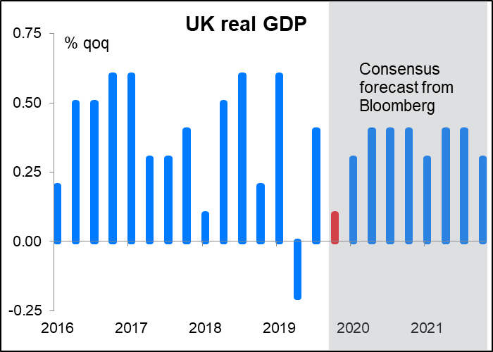
(Sharp-eyed readers will notice that the forecast in the above graph is not negative; on the contrary, it’s for +0.1% growth. This is because Bloomberg has two different sets of forecasts: the near-term forecasts, which they get by calling around and surveying brokers, and the long-term forecasts, which they get by scraping brokerage research. The forecast in the first graph is the short-term one, whereas the second graph uses the long-term forecast. I kept it that way so that the second graph would be consistent throughout the forecast period. QoQ growth of +0.1% in Q4 is not impossible; it would require December growth of +0.3% mom, whereas the consensus forecast is +0.2%, so not so big a beat.)
The only major central bank meeting of the week is the Reserve Bank of New Zealand (RBNZ). The market isn’t expecting the RBNZ to change rates any time soon, and those expectations haven’t changed much recently, either.

The key point for this week’s decision was Wednesday’s New Zealand employment data. Like the Fed, the RBNZ has a “dual mandate” – it’s required to set monetary policy “with the goals of maintaining a stable general level of prices over the medium term and supporting maximum sustainable employment.” That level isn’t spelled out, but at the last RBNZ meeting, in November, Monetary Policy Committee members opined that “employment remains close to its maximum sustainable level…” That was when the unemployment rate was 4.1% – it fell to 4.0% in Q4. So if it was close then, it’s even closer now.

Meanwhile, inflation is right in the middle of the RBNZ’s 1%-3% target range, and inflation expectations are well anchored at that level, too.

Accordingly while they may make some worried noises about the impact of the coronavirus on the New Zealand economy, I would expect them to echo the Reserve Bank of Australia’s relatively optimistic response and not make that many changes. I expect a relatively dull meeting with little market reaction.


